Carson Print
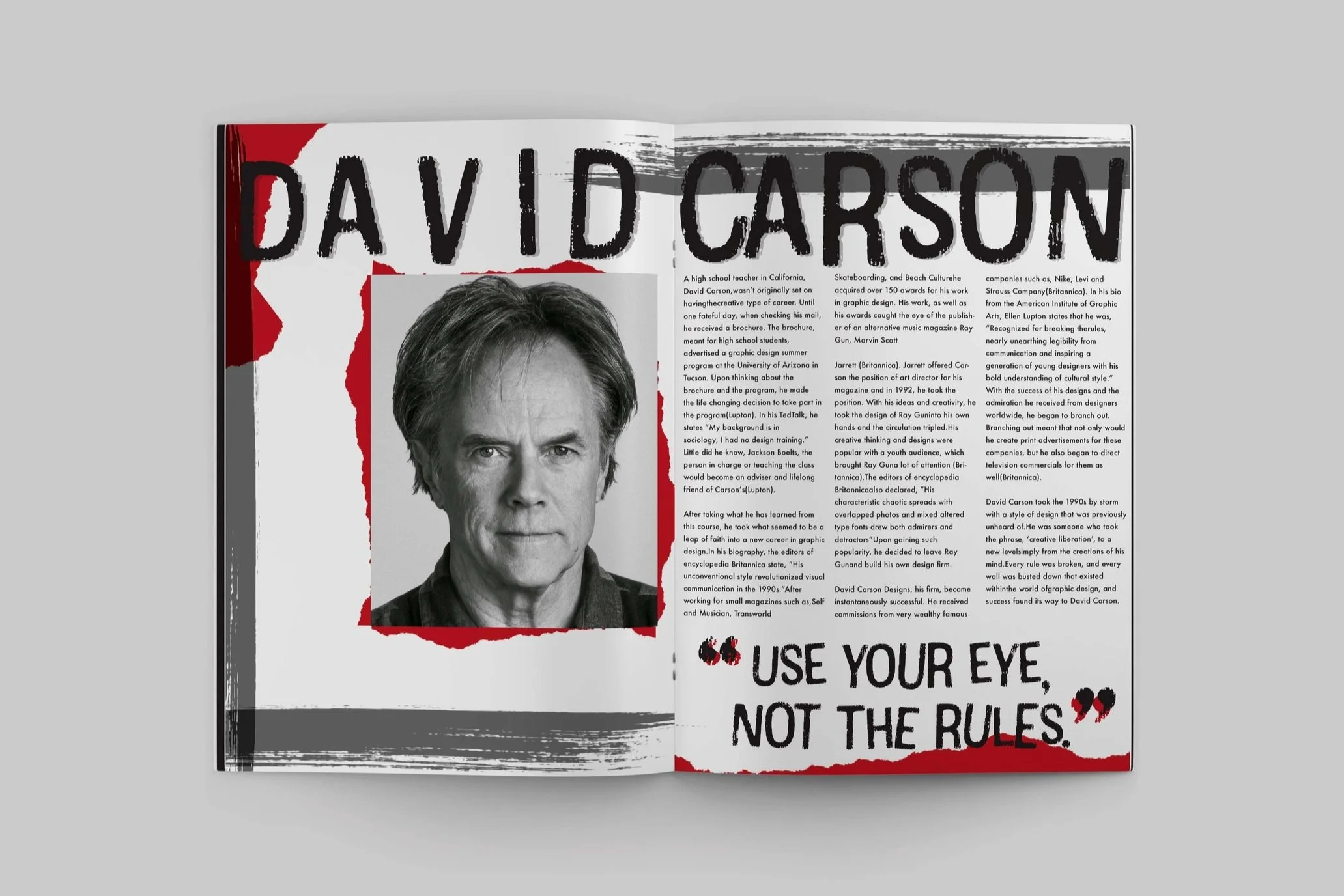
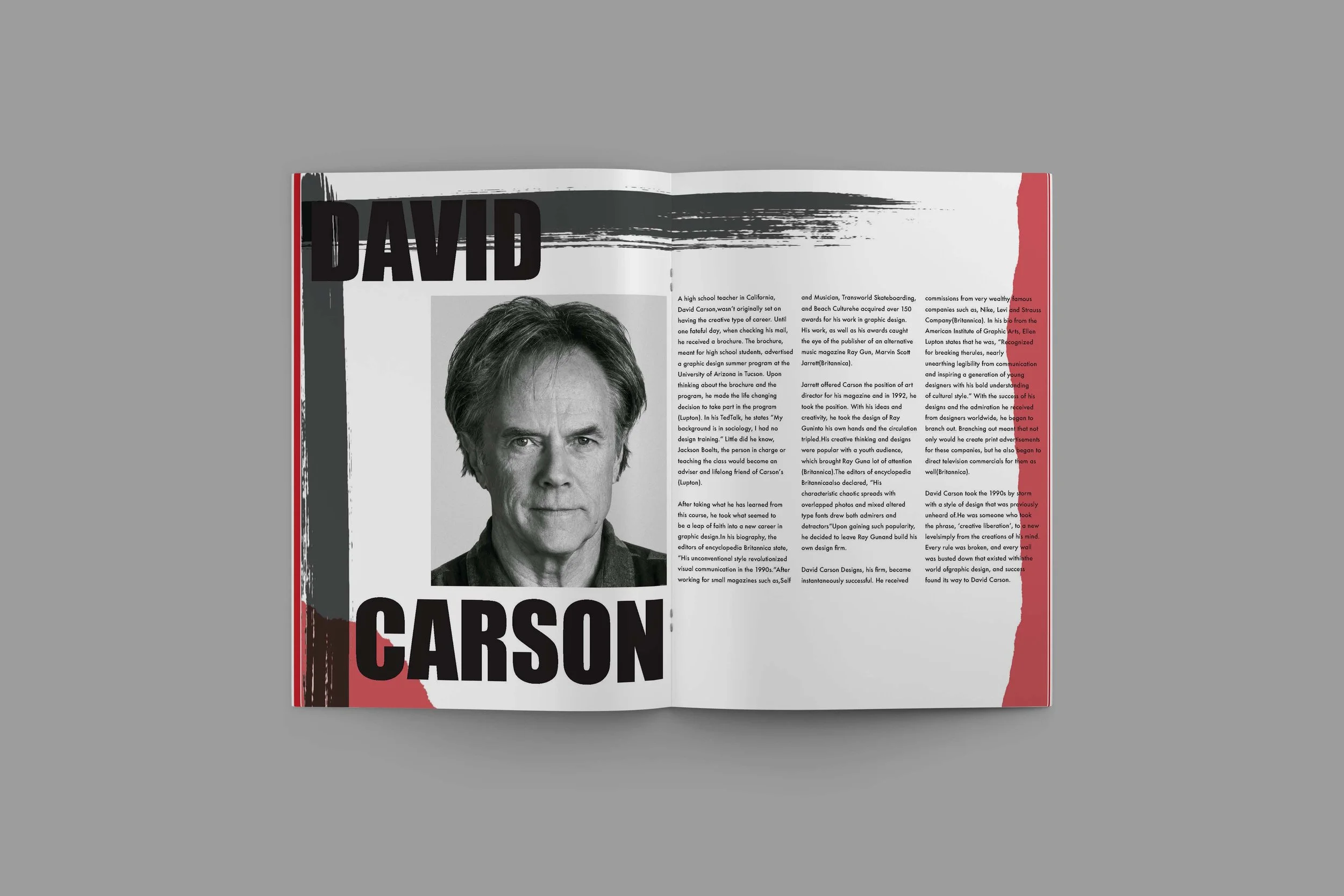
David Carson
David Carson took the 1990s by storm with a style of design that was previously unheard of. He was someone who took the phrase, ‘creative liberation’, to a new level simply from the creations of his mind. Every rule was broken, and every wall was busted down that existed within the world of graphic design, and success found its way to David Carson.
Sketches
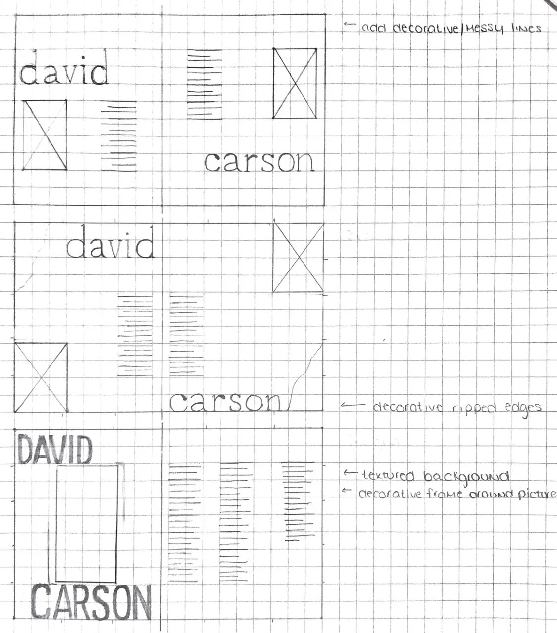
I started off this project like many others, with my sketchbook. I used grid paper to ensure that I stuck to the grid that I was developing. After designing a few layouts, I then knew that I had my ideas flowing enough to turn to my Adobe Suite and start designing in InDesign, while also turning to Photoshop for different design elements.
Type & Color Studies
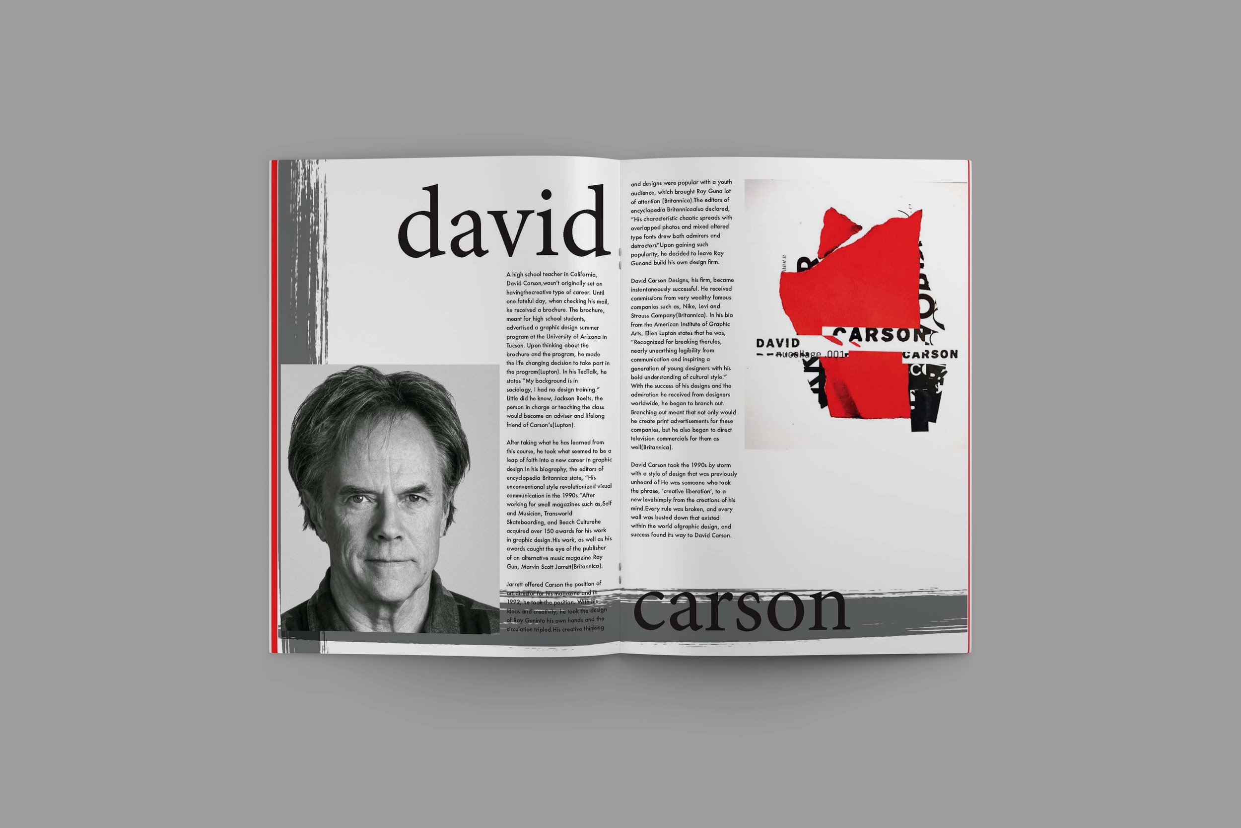
I used a basic red once again because most of David Carson’s designs highlight the use of bright vibrant colors. I also think that the red represents the type of rebellion that Carson’s design style and advice radiates! Building off of that rebellious style, I thought that the typeface Cotton Regular was the perfect match for a spread highlighting David Carson and his work. I used Futura, a more basic typeface, for the body copy.


Compositions
Though my compositions are fairly similar in color palette and style, they all highlight the use of different layouts and some different elements. Because David Carson is all about breaking the unwritten rules of design, I decided that a spread that highlights him needed a bit of edge. I used different ripped paper samples as well as paint strokes to almost mimic the feeling that his designs give.

Final Design
After going through the critiquing process, my peers ultimately decided that this composition was the strongest of the three. I had a lot of fun making this design and ‘breaking the rules’ in different ways. I think the quote that I highlighted in the spread highlights all that David Carson stands for, as does the final design!