CT Wine Guide & Passport
The App & The Redesign
I worked on this redesign with the extremely talented Brandi Pinette for mobile interaction design. We decided that the existing app Connecticut Farm Wine could use a more modern, functional redesign.
“CT Farm Wine is your digital passport to Connecticut’s wineries. Visit a minimum of 12 participating wineries and be entered to win one of 60 prizes! Visit a participating farm winery, scan the QR code to check-in and collect your stamp.”
With this app, users can travel across Connecticut and visit different wineries to get a stamp on a virtual “passport” stamp for each winery. The goal was for the user to visit as many participating wineries as possible to be entered to win a prize.


Competitive Analysis
Vinified and GotBottle mobile apps were used in the competitive analysis for this app. Both apps have information regarding wine tastings and allow users to keep track of wines that they have tried and liked or disliked. Because the CT Wine Guide and Passport is aimed at providing similar services, these apps were used to identify any gaps in the market as well as to highlight any common existing pain points.
User Survey
User surveys were used to gain an understanding of the demographics and likes of the target audience. This information was used to help determine what features would be most successful to include in the app. The results were used to make informed decisions regarding the development of personas and empathy maps to ensure the product was being developed with the target audience in mind. If you would like to access the survey, you can check that out here.


Personas
Three personas were developed to represent users that are likely to exist within the target audience. Each persona is accompanied by a different scenario and has different motivations, goals, frustrations, personalities, and understanding of wine. The personas were frequently referenced to ensure the project scope matched the goals and motivations of the target audience.
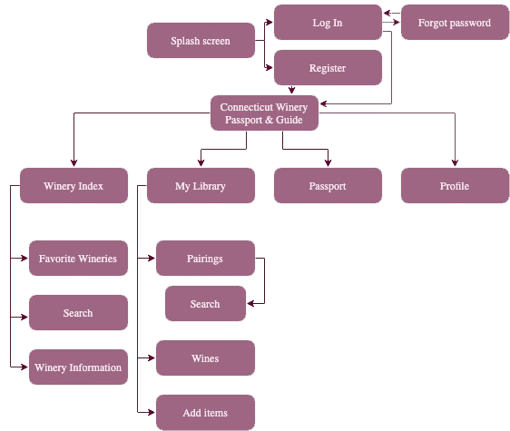
Information Architecture
An information architecture was developed to understand the best method of organizing information within the app. It was important to keep the personas in mind when developing this phase to understand the method of organization that would be easiest for ideal users to move throughout the app. Information was organized into different categories such as Winery Index, Library, Passport, and Profile.
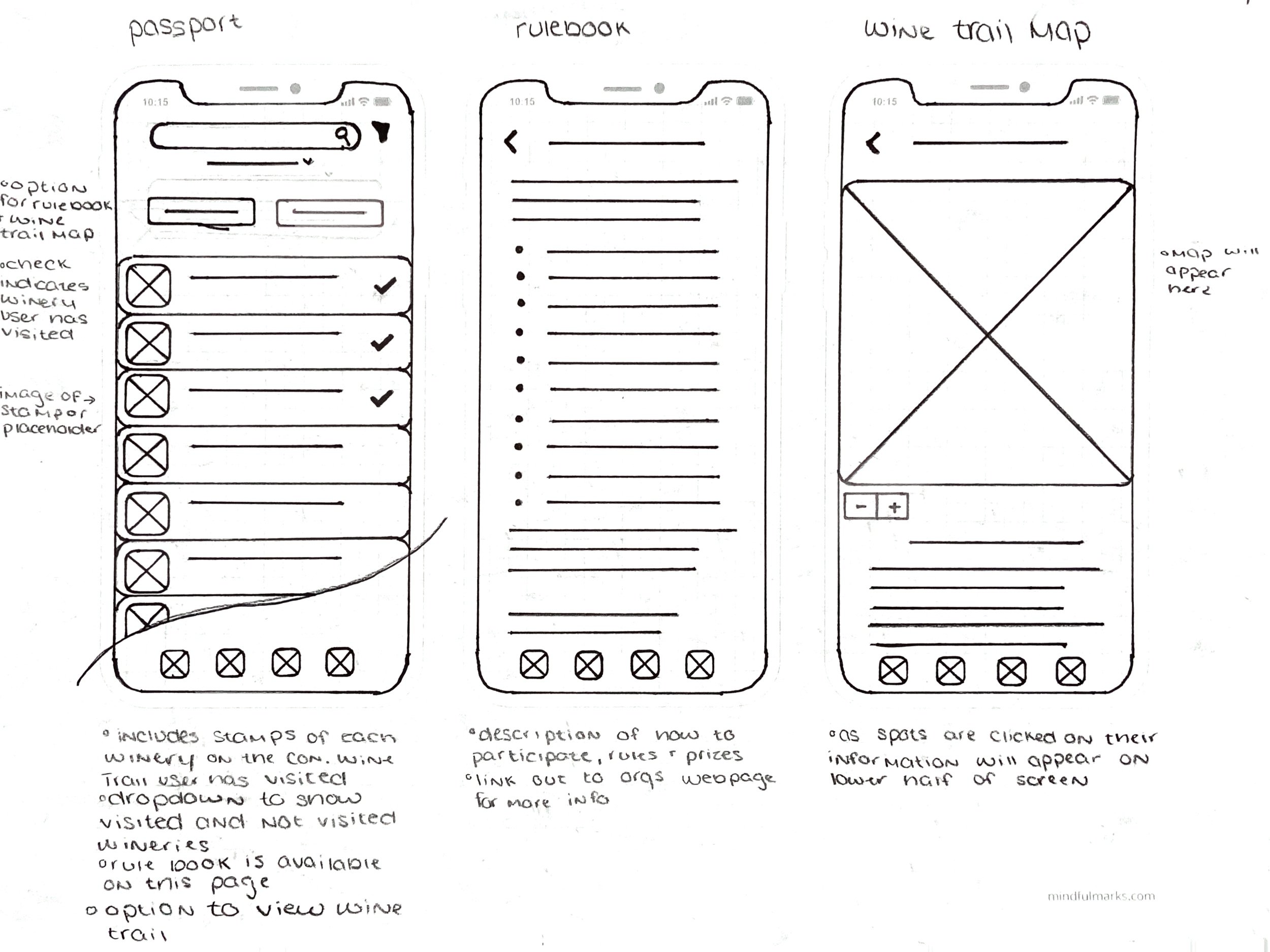
Wireframe
A wireframe was developed to understand the general layout of the app. For this project, I chose to sketch the wireframe instead of developing it in a software so I had absolute freedom in customization. Taking the extra time to sketch the wireframe allowed me to take the necessary time to think about the placement of each element within the app.


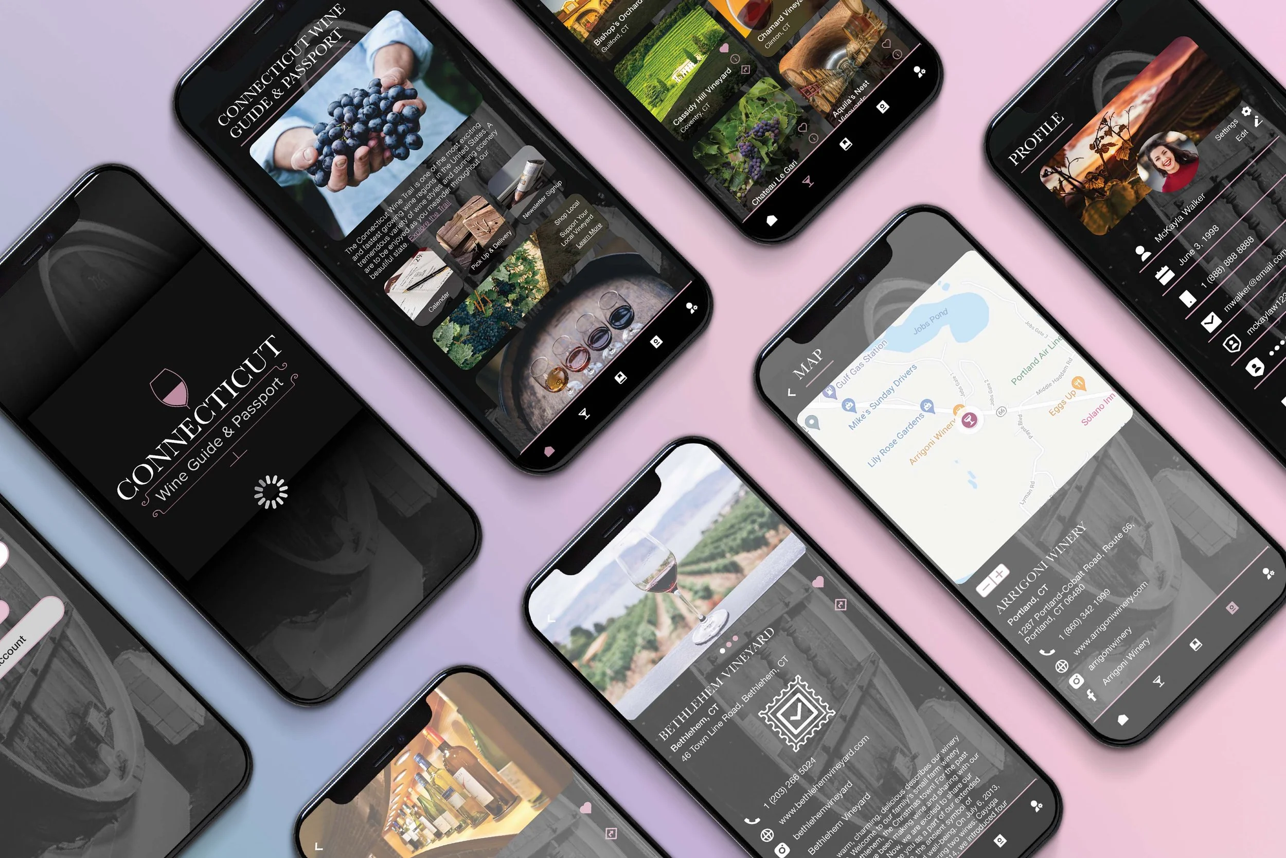
Final Design
The final design was developed and prototyped within Adobe XD. It provided a necessary redesign to the existing CT Wine Guide and Passport app and allows users to have a more enjoyable experience when interacting with the app.
Lessons Learned
This project was the first collaboration that I had ever done. Prior to the development of this redesign, each project I had worked on I had done so on my own. Brandi was the best partner I could have asked for. From the start, we began by discussing what we thought the final app aesthetic should look like before we began the redesign process. When we reconvened to show each other our ideas and they were nearly identical, we knew that we would be a great pair to work on this app! However, no project is ever perfect and there are a few things that I wish we had done differently. The thin font that we used can cause readability issues with light-colored text on a dark background, and I feel as though a neutral background would make for a cleaner look on each of the pages. I also feel as though the icons do not match the overall aesthetic that the app has. Overall, this project was a great learning experience and I learned how to work side-by-side with others on UX/UI projects!