Helvetica Type History Print
The Project
For this project, I had to develop a design from scratch that highlighted the type history of the typeface, Helvetica. Because it is a print design, I wrote a body copy on the history of its creation and development to use in the final piece. I learned a lot about its history and had a great time making this spread!

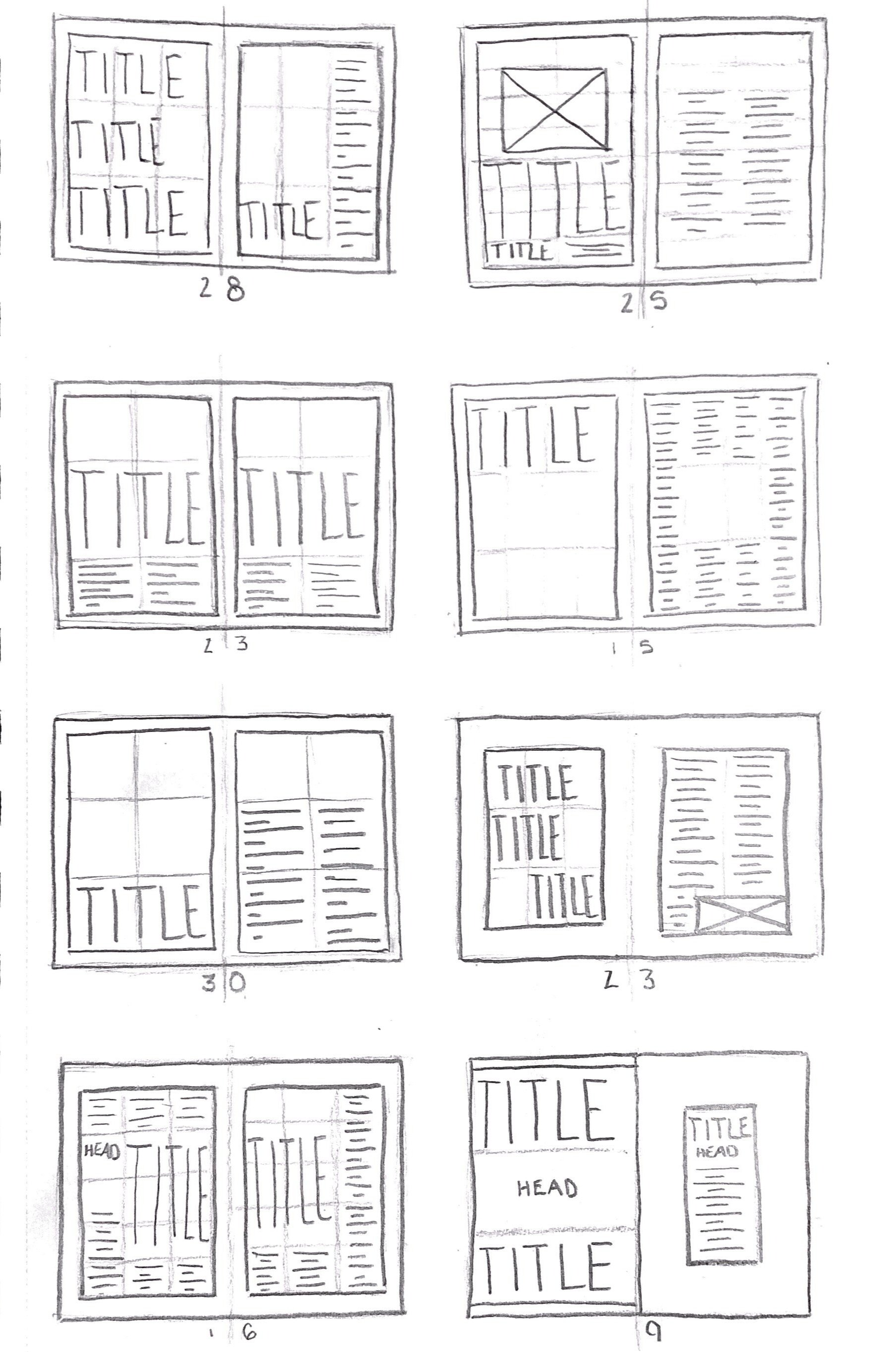
Sketches
Prior to diving into the design, I broke out my sketchbook and drew out a couple of different variations of what I thought I would want my spread to look like. Though I did not use one of these sketches, they allowed me to get my ideas out on paper and start to brainstorm possible layouts.
Though most of my projects begin in a quick sketching session, I don’t always fall back on the designs that I scribbled onto that page. Sometimes I use the sketching process solely to generate the flow of ideas and learn what direction I want the final design to go in.

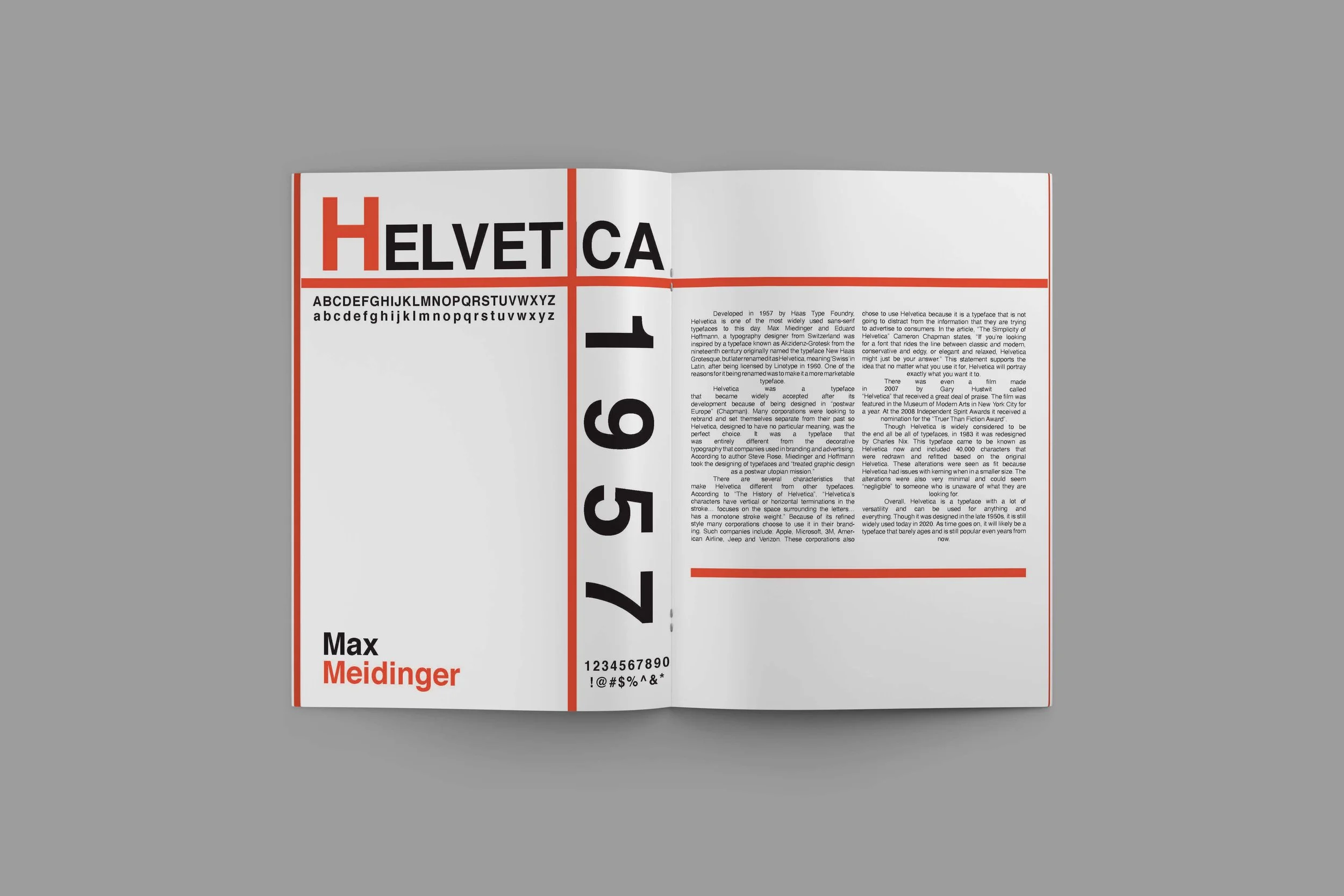
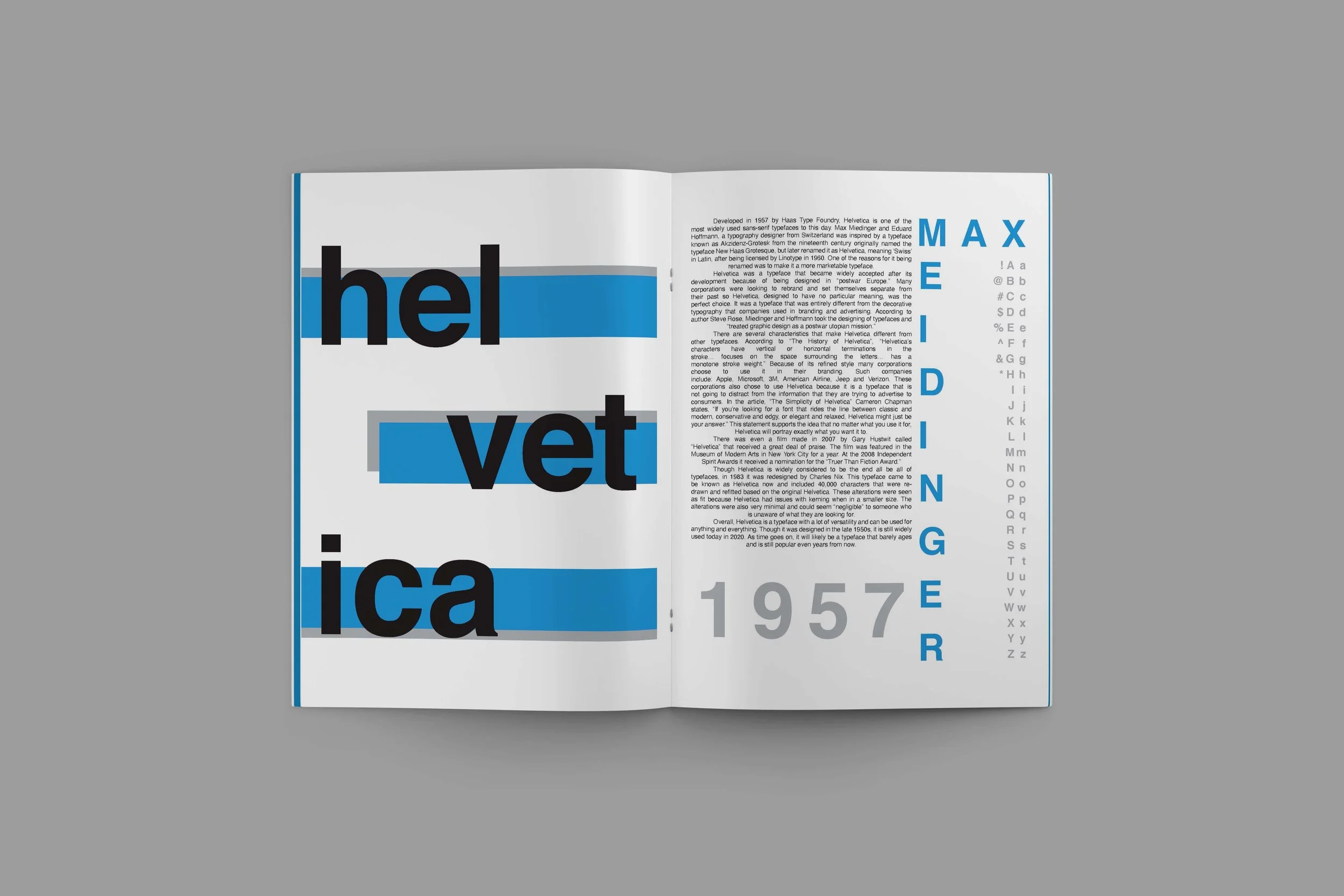
Color Studies
Because I wanted the typeface to do most of the talking for this piece, I didn’t want to use too many colors to draw attention away from that. For my final design, other than black and white, I chose a basic red and used different opacities throughout the piece for a bit of variation.
Compositions
Just as I sketched out multiple layouts, I designed a few different compositions to generate a more high-fidelity flow of ideas. After creating each composition, I presented them to my peers to get feedback and critiques. For this project, the feedback was overwhelmingly in favor of my third design. After a bit of refinement I finally finished my design.
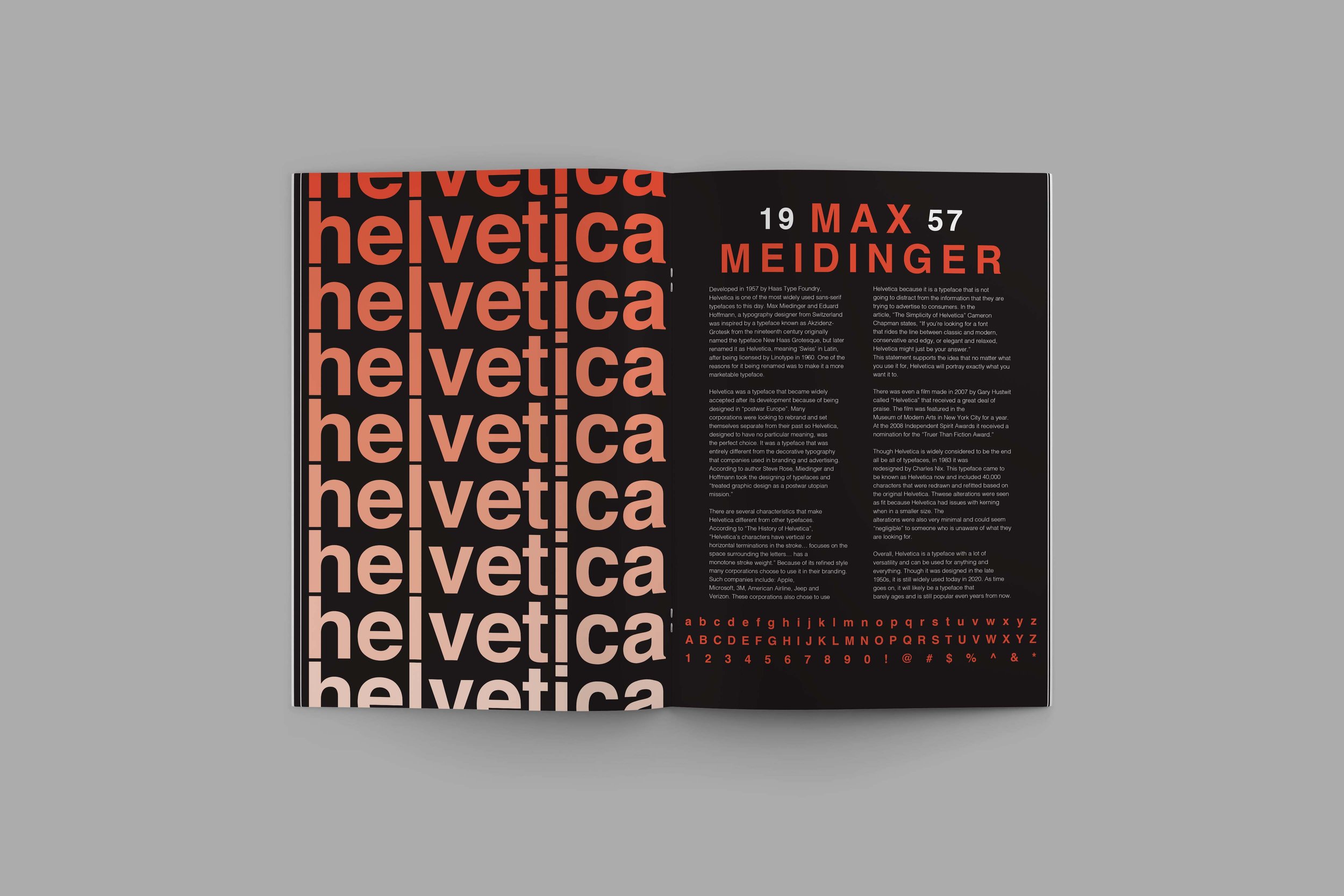
Final Design
This spread is one of my favorite print designs that I have done to date. Though the gradient of colors in the text on the left page is simple, I think it does a lot of speaking for the design and is definitely an attention grabber. I’m extremely happy with how the final product turned out!
