Mine: Budgeting for College Students
The Concept
Mine was developed as an app concept for mobile interaction design. I wanted to make something that had a niche in the market of budgeting apps, so I developed Mine to be a financing and budgeting app for college students. Mine is different because it allows you to finance student loans and also have access to free counseling services to understand the best way to pay them off.


Competitive Analysis
I conducted a competitive analysis to gain an understanding of existing competitors as well as the product market.
Mint and Pocketguard mobile apps were used in the competitive analysis for this project. Both apps handle personal finance, budgeting, and money management. Because Mine is aimed at providing similar features, these apps provided insight into gaps in the market and existing consumer pain points. Pain points identified within the market mainly appeared to consist of issues regarding the organization, connectivity, and transaction labeling.
Empathy Map
An empathy map was developed to understand the deeper thoughts and decision-making process of users within the target audience as well as the problem to be solved.
This step highlighted issues surrounding existing money management apps. It was found that most financing apps did not cater to individuals who were not already financially established, and left them to figure out most money management issues on their own. Solutions included providing resources within the app for users to refer to when they require assistance or general information.


Personas
Personas were developed to represent different user types that would exist within the entirety of the product audience.
Each has different personalities, motivations, personal experiences, and goals. ‘Mason’ the college senior is looking for something to refer to time-to-time to ensure that his spending is on track and that he does not go over his budget. Whereas, ‘Harper’ the college junior is looking for all-around assistance and a guide to understanding the best money management practices.
The personas were frequently referenced to ensure the project scope matched the goals and motivations of the target audience.
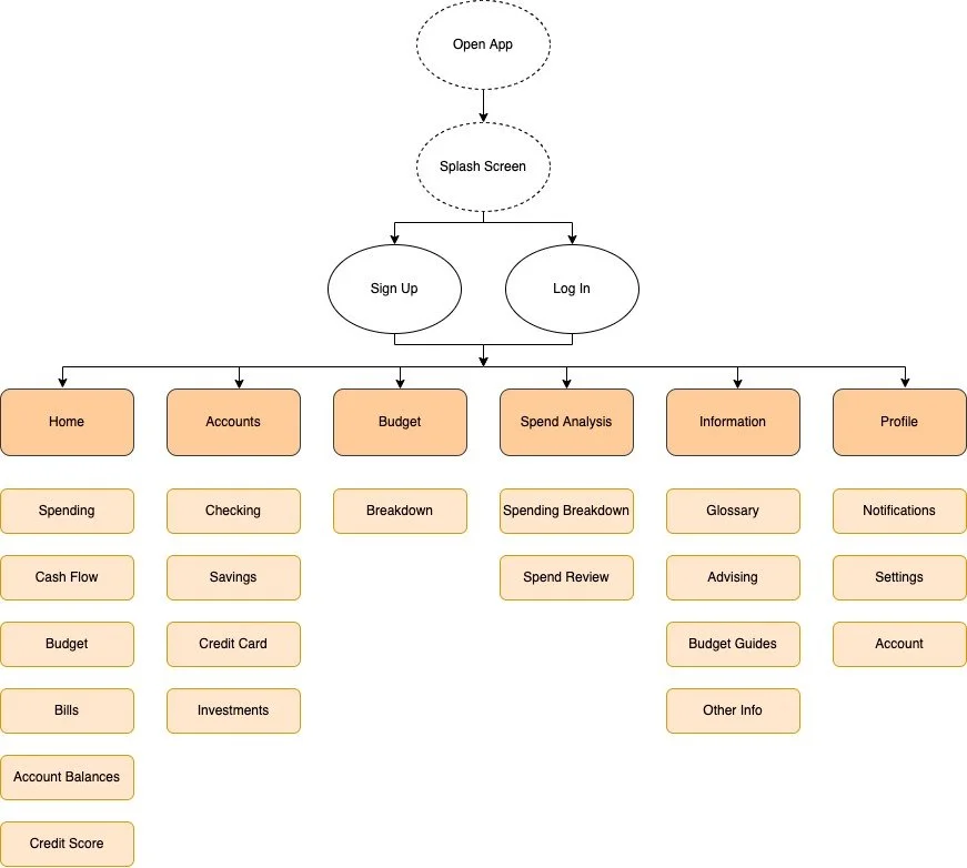
Information Architecture
An information architecture was developed to understand the best method of organizing information within the app.
It was important to keep the personas in mind when developing this phase to understand the method of organization that would be easiest for ideal users to move throughout the app. Information was organized into different categories such as Home, Accounts, Budget, Spend Analysis, Information, and User Profile.

Final Design
The final design was developed in Adobe XD and prototyped using InVision.
Mine provides all of the basic resources that other financing apps have while going the extra mile to provide resources for users. These resources include a glossary of unfamiliar terms, links to financial advisors, guides to best budgeting practices, and other general helpful information. This information was important to the persona ‘Harper’ and was found to be a solution from the empathy map developed in the early project stages, so it was important to accommodate users like them that exist within the target audience.
Lessons Learned
This was one of the biggest mobile app concepts that I had developed in the early stages of my experience with UX and UI. As I worked through each phase of the product development (ex. information architecture, user surveys, personas, etc.) on my own, I began to understand the importance that each piece played to the larger puzzle. I realized that it is significant to devote plenty of time and effort to the earliest of stages because they will frequently be referenced throughout each of the project phases that follow. Looking back on this project, I would love to develop the UI a bit further and design it to conform a bit more with some of the modern mobile and web trends that are currently popular.