Sagmeister Print
Stefan Sagmeister
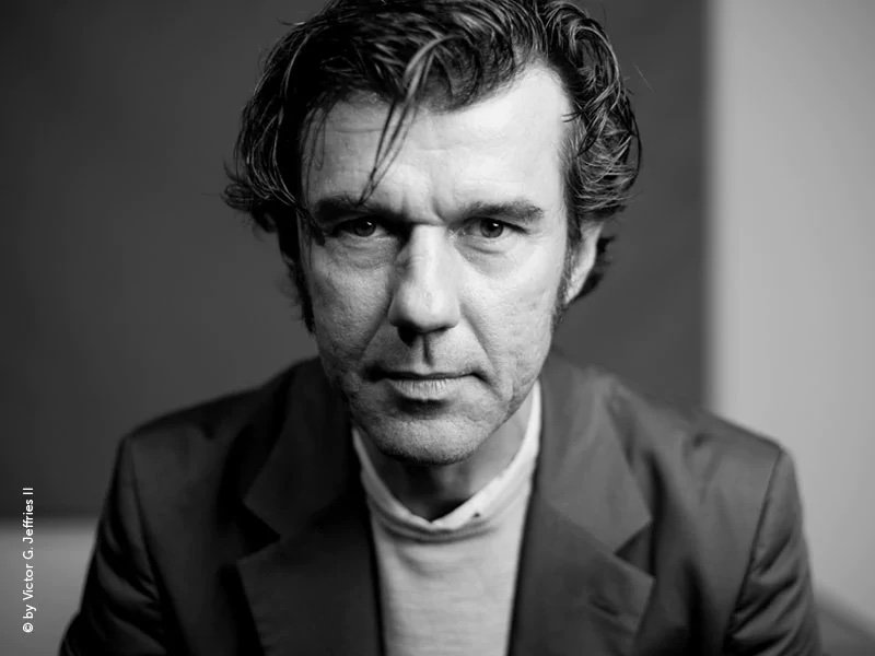
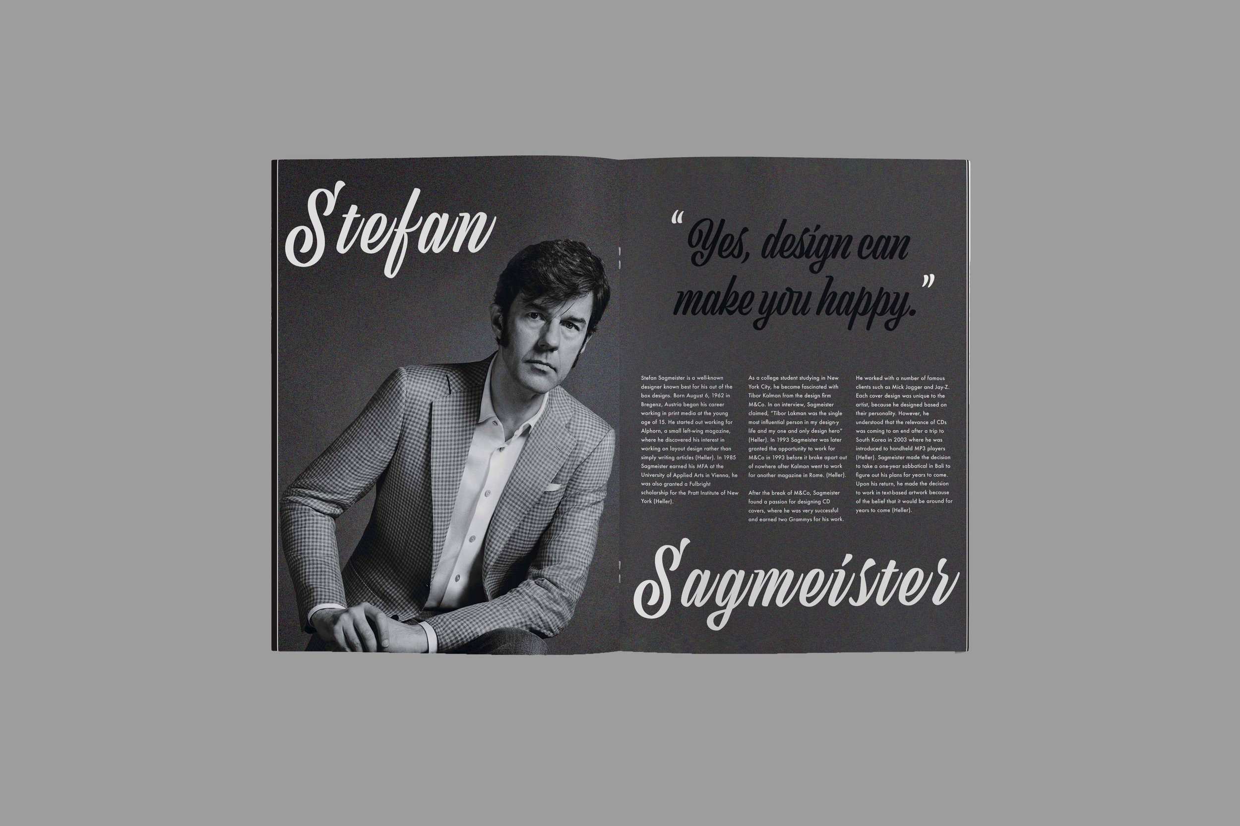
Stefan Sagmeister is a well-known designer known best for his out-of-the-box designs. Born August 6, 1962, in Bregenz, Austria began his career working in print media at the young age of 15. He started out working for Alphorn, a small left-wing magazine, where he discovered his interest in working on layout design rather than simply writing articles (Heller). In 1985 Sagmeister earned his MFA at the University of Applied Arts in Vienna, he was also granted a Fulbright scholarship for the Pratt Institute of New York (Heller).
As a college student studying in New York City, he became fascinated with
Tibor Kalman from the design firm M&Co. In an interview, Sagmeister claimed, “Tibor Lakman was the single most influential person in my design-y life and my one and only design hero” (Heller). In 1993 Sagmeister was later granted the opportunity to work for M&Co 1993 before it broke apart out of nowhere after Kalman went to work for another magazine in Rome. (Heller).
After the break of M&Co, Sagmeister found a passion for designing CD
covers, where he was very successful and earned two Grammys for his work. He worked with a number of famous clients such as Mick Jagger and Jay-Z. Each cover design was unique to the artist because he designed based on their personality. However, he understood that the relevance of CDs was coming to an end after a trip to South Korea in 2003 where he was introduced to handheld MP3 players (Heller). Sagmeister made the decision to take a one-year sabbatical in Bali to figure out his plans for years to come. Upon his return, he made the decision to work in text-based artwork because of the belief that it would be around for years to come (Heller).
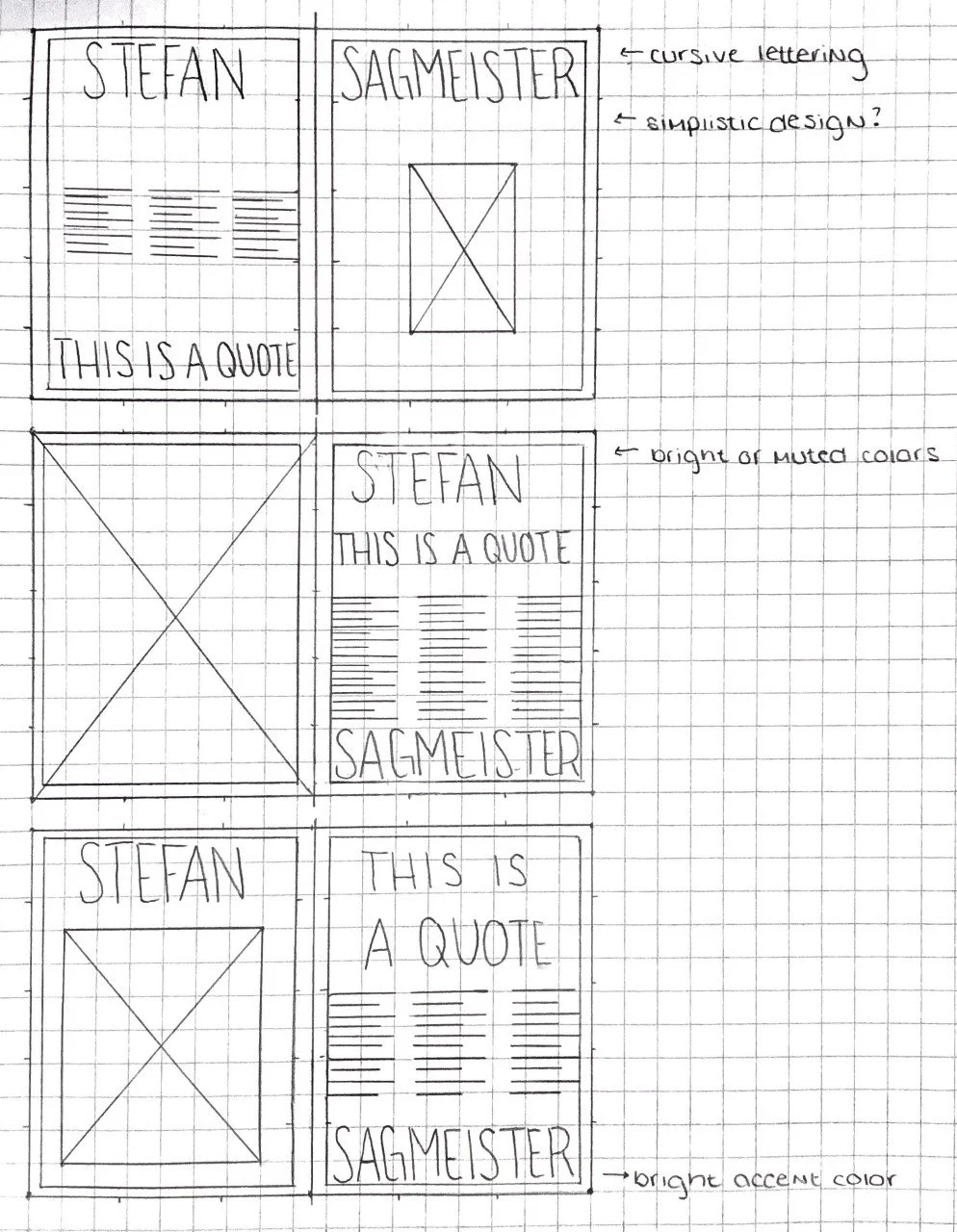
Sketches
Just as I begin most other projects, I once again broke out my sketchbook to get my ideas out of my head and onto paper. I started with three basic layouts on grid paper to ensure that in my design I stuck to the grid that I developed for the spread. After sketching for a while I turned to the Adobe Suite to begin the high-fidelity design process.
Type Studies
I wanted to use a font that represented Stefan Sagmeister’s design style for the headers, so I decided on Viktor Script. This typeface is similar to the flowy writing style that he uses in many of his designs, and I thought it would be a great addition to the spread. Because the headers were so eye-catching I wanted to keep the body copy more basic, I decided on Futura.


Compositions
Once again, the process repeats itself and I designed three different compositions with completely different layouts. I decided on using a more grayscale color palette in two of the designs because I wanted the typeface I used for the hero title to do most of the communicating for the design, and I did not want to overwhelm the audience. I presented the designs to my peers, and though they all received fairly positive feedback and critique, most people leaned toward my third design.
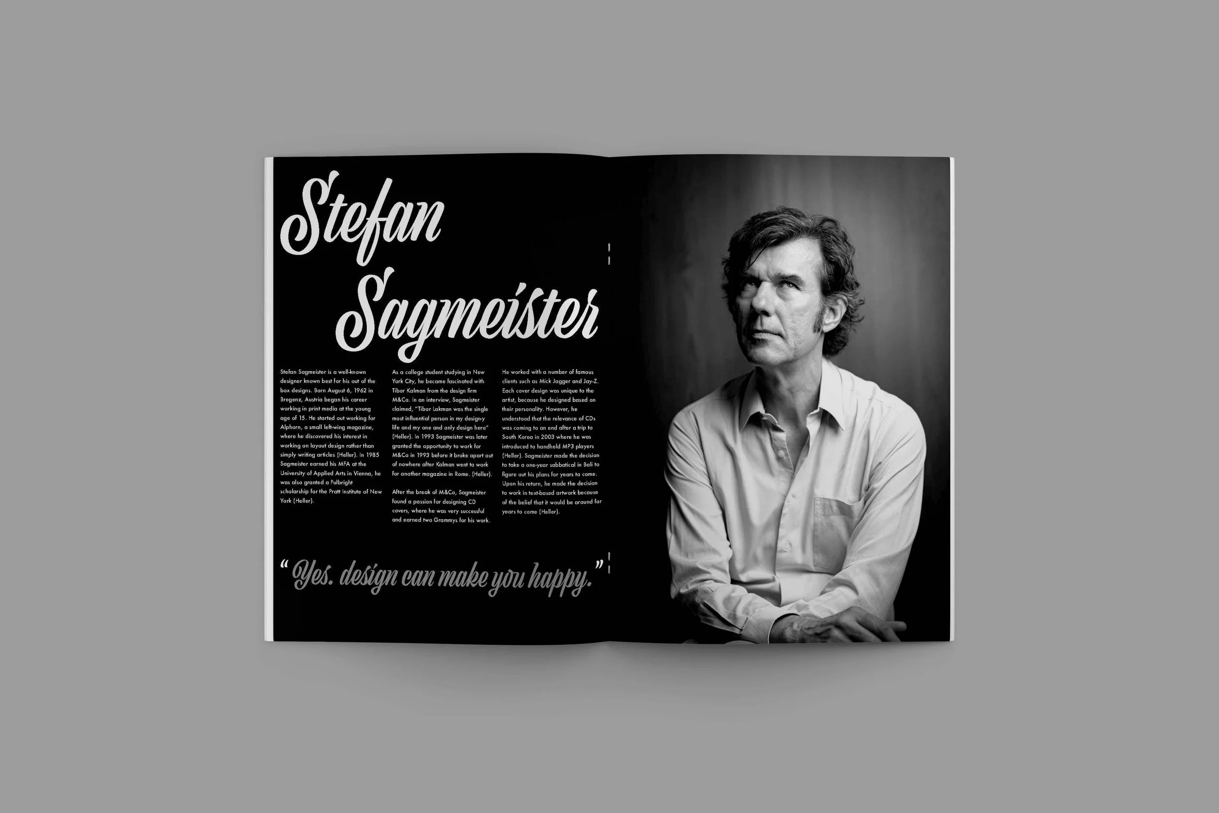
Final Design
I’m happy with how the design turned out, and how elegant it looks. I think the hero image and text communicates a lot of the design and would draw a reader in to read more about Stefan Sagmeister!
